Article Text

Statistics from Altmetric.com
Introduction
All medical treatments have potential harms as well as benefits, and it is vital that everyone has a good understanding of what these might be, how dramatic they might be and how likely. In fact, in the UK, the Montgomery judgement in the supreme court in 2015 (see Box 1) has made it a legal necessity for patients to be given comprehensible, personally relevant information about all reasonable treatment options, including none.1 So, how should we ensure good, clear communication of relevant evidence?
The Montgomery judgement
In 1999, Nadine Montgomery was preparing for the birth of her son Sam. She was of small stature, with diabetes, and was concerned about being able to give birth naturally. Unfortunately, difficulties did arise during birth, and Sam suffered brain damage as a result. Her obstetrician had not discussed the risk of this particular complication occurring, deeming it best Nadine attempted a vaginal birth. On appeal at the supreme court, Nadine Montgomery won her case. This laid down a new legal basis for informed consent, in line with the General Medical Council guidelines;1
“The doctor is therefore under a duty to take reasonable care to ensure that the patient is aware of any material risks involved in any recommended treatment, and of any reasonable alternative or variant treatments.”
“The test of materiality is whether, in the circumstances of the particular case, a reasonable person in the patient's position would be likely to attach significance to the risk, or the doctor is or should reasonably be aware that the particular patient would be likely to attach significance to it.”
“The assessment of whether a risk is material cannot be reduced to percentages. The significance of a given risk is likely to reflect a variety of factors besides its magnitude”
“The doctor’s advisory role involves dialogue, the aim of which is to ensure that the patient understands the seriousness of her condition, and the anticipated benefits and risks of the proposed treatment and any reasonable alternatives, so that she is then in a position to make an informed decision.”
“This role will only be performed effectively if the information provided is comprehensible. The doctor’s duty is not therefore fulfilled by bombarding the patient with technical information which she cannot reasonably be expected to grasp, let alone by routinely demanding her signature on a consent form.”1
This article therefore reviews what is known about how doctors can best communicate evidence so that patients can make informed decisions based on them, as the Montgomery Judgement demands. At first glance, it might seem that this should be a relatively simple question to answer, but there are a couple of big underlying problems.
Understanding the problem
One problem is what do we mean by ‘good understanding’ of a risk or benefit? Clearly, we do not just mean someone can recall a number—the percentage chance of something happening. Knowledge of a fact is not the same as understanding. We want a patient to imagine the range of things that might happen to them and to understand how likely each is compared with other things that they are familiar with; to slot these new scenarios into their personal framework of ‘what might happen in my life’ in an appropriate way, allowing them to weigh up evidence and to make a decision that is right for them. What an ‘appropriate’ way to imagine them is, will depend very much on their individual experiences and perception. That personalised, internalised concept of risk or chance is, then, very hard to define, let alone measure.
A patient’s concept of the numbers involved is also only a part of what feeds into their final decision. Their emotions and personal values will all have a huge influence on their risk perception and decision-making, so we cannot assess their understanding of the facts by what decision they make either.2 3 Some of these (such as their feelings about a particular outcome) are entirely appropriate factors to weigh in their decision. Others (such as their feelings towards their doctor) we may wish to minimise. There are so many things that can affect a patient’s understanding, especially when we are considering a personal interaction, that minimising these unwanted biases is very hard.
This complexity means that it is not easy to create simple guidance on how to communicate evidence clearly to patients.
However, there are some useful findings from research that are worth every healthcare professional knowing.
Target information to the decision in hand
Research has shown how important it can be to cut to the chase when giving people information. For instance, studies of an online tool to help with the choice of adjuvant therapies after breast cancer surgery found that the standard format—bar graphs giving the potential outcomes of a range of four different options—was more easily understood if it was simplified, giving only the outcomes for the two options the patient was weighing up at that time.4 5 It is important, then, to understand what the patient in front of you—or your patient population in general—really cares about and wants to know more about before launching into giving information.
The question of ‘how much information is too much’ is obviously tricky to answer in the abstract, but if you are giving information in person, you can tailor it, assessing how much an individual patient has taken in. Breaking up the conversation into chunks and at the end of each, using the ‘teach back’ method—asking patients to state back in their own words what they have understood—will help them process it and help you get the right level (see Box 2).
Teachback and clear communication
‘Teachback’ is a method of checking that you’ve explained something clearly. You can ask patients and carers to tell you what they’ve understood, or ask them to show you if you’ve given them instructions on how to do something. NHS Scotland’s Health Literacy Place website has training on how to do this effectively (http://www.healthliteracyplace.org.uk/tools-and-techniques/techniques/teach-back/).
The Centers for Disease Control in the USA have put together plain language materials and resources (https://www.cdc.gov/healthliteracy/developmaterials/plainlanguage.html).
Use familiar everyday words and be careful of particularly emotive ones
Since we know that our emotions influence our decision-making, it is vital to be very careful not to arouse them unwittingly or too much. For instance, emotive terms like ‘mad cow disease’ can evoke fear that overwhelms any probabilistic information alongside it.6 However, unfamiliar terms also appear more frightening and are deemed more risky. This also applies to words that are just difficult to pronounce (such as the fictional food additive hnegripitrom compared with the equally fictional magnalroxate)—they also seem to be judged riskier!7 It may also be that labelling symptoms as a ‘disease’ or a ‘syndrome’ may make people more likely to over-ride information about evidence of (in)effectiveness of treatment options too.8 9 Consult the plain resources in Box 2 and test out words with a suitably non-medical audience, such as patient representatives or a focus group, to find out which they find confusing or frightening (eg, the term ‘side effects’ is often preferred to ‘adverse effects’ by patients).
Don’t rely on words, give numbers alongside them
Words mean different things to different people. Tests of what patients understand by the European Medicines Agency’s recommended terms to convey the probabilities of adverse effects consistently show that they are misinterpreted by both healthcare professionals and patients.10–12 For instance, when non-medically trained people were told an adverse effect was ‘common’, they tended to think that it will happen around 50% of the time. Doctors surveyed in one study put the probability of ‘common’ at around 25%. In fact, in official communications and patient information leaflets, this term is used for adverse effects that occur 1%–10% of the time. Crucially, these differences in people’s perceptions of the risk also influenced their opinions on whether they would take the medication or not.
Never give just relative risks (and be careful with just absolute risks)
Medicine changes our risks: lowering some and raising others. But knowing just how much it has changed is not enough information to make a decision. The classic example is the famous contraceptive pill scare of 1995, which followed publication of official advice that newer contraceptive pills were associated with twice the risk of venous thromboembolism compared with older products. Not surprisingly, women reacted by stopping taking the contraceptive pill, and statistics show an excess of about 12 400 additional births and about 13 600 additional abortions in the following year.13
The twofold increase referred to by the public statements around the contraceptive pill is a relative risk increase (see Box 3). What was the absolute risk that had increased twofold? About 1 in 7000 per year for women on the ‘second-generation’ oral contraceptive pill. Those on the ‘third-generation’ pill, about which the warning was made, had a doubled risk, then, of about 2 in 7000. For women who become pregnant, ironically, the absolute risk of venous thromboembolism is about 4 in 7000 per year.14
Ways to communicate risks
There are many different ways to convey a risk, and the terms can get very confusing (especially as the symbol % can be used for both percentages and percentage points).
Here is a quick guide:
Absolute risks are simply the chances of an event happening, the same as its incidence or ‘actual risk’ (eg, a 10%, or 10 in 100, chance of having a stroke).
Absolute Risk Reduction (ARR) or Absolute Risk Increase (ARI) is the difference—in percentage points—between the control group and the treatment group.
For example, if 2 out of 100 people (2%) taking a drug experience stroke, compared with 10 out of 100 people (10%) taking a placebo, the ARR is 8% (percentage points) or 8 in 100 people helped by the drug (10%–2%=8%).
The Number Needed to Treat (NNT) is the number of patients you need to treat to prevent one additional bad outcome.
For example, if a drug has a NNT of 13 over 1 year, it means you have to treat 13 people with the drug for 1 year to prevent one additional bad outcome.
The NNT is also the inverse of the ARR. So if the ARR is 8%, the NNT is 1/0.08=12.5 (round to 13). Without explanation and careful wording, these are also difficult for patients to understand.32
Relative risks are comparisons between two risks. They tell you nothing about the absolute chance of an event happening.
Risk Ratios (RRs) are a common form of relative risk: the ratio of one risk to another.
For example, if 2% of people taking a drug experience stroke, compared with 10% of people taking a placebo, the RR is 0.2 (2/10); (a risk ratio of 1 would mean the drug had no effect, a RR <1 would mean it reduced stroke incidence, RR>1 would mean it had increased it). These are commonly reported in scientific papers but would likely be meaningless to a patient.
The Relative Risk Reduction (RRR) or Relative Risk Increase (RRI) is the percentage change in events between the treated group event rate compared with the control group event rate.
For example, if 10% of people taking a placebo experience stroke, but only 2% of people taking the drug experience stroke, the RRR is 80% ((10%–2%)/10%=80%).
Relative risks, then, can exaggerate the perception of difference, and this is especially prominent when the absolute risks are very small. They should never be used alone.
Conversely, absolute risks can also be misleading on their own, without context to tell whether that risk is relatively high or low (eg, ‘the risk of you developing breast cancer at some point in your life is about 14%’ can only be interpreted when given more information about population averages). Giving absolute numbers such as ARRsBox 3 is good in principle but, like everything, has to be looked at on a case-by-case basis. When absolute risks are very low, the numbers involved can be difficult for people to comprehend. In fact, a very small number (such as the chance that a test result could be wrong) is often ‘rounded down’ in our brains to zero over time.15 If it is important for people to realise that although the absolute risk is very low, the change is very significant and warrants their attention, then it might be appropriate to use the relative risk or increase as well. We all need context to understand numbers, and relative risks can help do that.
Give risks in the form of both frequencies and percentages, unless you are asking people to compare multiple risks
To give numeric evidence, you need to choose the format to give those numbers in. Generally, the choice is between a percentage (eg, 20%) or a frequency (eg, 20 in 100). It is not clear which helps people the most, but what is clear is that everyone—regardless of education level—can easily get confused between them (eg, mistaking 20% for 1 in 20).
It is also worth being aware that people respond differently to the same number expressed as a percentage and as a frequency. In one study, professional forensic psychiatrists were asked to read biographies of violent patients and to assess their risk of harming someone in the 6 months after release. They were asked to record that risk both as ‘low’, ‘medium’ or ‘high’ and also to put a number on that risk, either as a frequency or as a percentage. It turned out that the psychiatrists assessed ‘20 out of 100’ to be higher risk than ‘20%’ (both when writing their own assessments and when reading others’). This is possibly because the act of thinking about ‘20 out of 100 patients like this are likely to cause harm to others on release’ opens the imagination to those 20 vividly violent patients and makes the risk much more clear and present.16
Given these issues, stating numbers as both a percentage and a frequency is probably safest to try to give people a balanced view if you are trying to help people understand a single number; but if you are asking people to compare risks, stick to just one or the other. The evidence is not strong, but comparing percentages seems to be easier than comparing frequencies.17 18 The only time there is strong evidence to prefer a frequency is in the case illustrated in Box 4, where you have ‘conditional probabilities’ and should instead use their frequency equivalent: ‘natural’ or ‘expected’ frequencies.
Simple frequencies and expected or natural frequencies
There is confusing terminology around two different kinds of frequency.
A simple frequency is just the chance of something happening expressed as one number out of another (such as ‘12 out of 100’). It can be used as another way of putting across a simple percentage.
A natural frequency or expected frequency is more complicated. It is another way of expressing what you might remember from school as a ‘conditional probability’.
The classic example of when natural frequencies are useful is a scenario of someone getting a positive test result for a rare disease.
Example for a disease with prevalence of 1%
The test has an accuracy of 90% for people who have the disease (sensitivity) but has a false-positive rate of 9% (specificity=91%) for people who do not have the disease.
Your patient has a positive test: what are the chances they have the disease?
The conditional probability is the probability of having the disease, given that they have a positive result, and is complicated to calculate.
Using natural or expected frequencies, however, would mean expressing all the parts of the question as simple frequencies, but starting with 1000 (or a similarly large number) and then breaking the frequencies down as you follow the logic of the scenario.
Calculation
Of the 10 who have the disease, the test will accurately diagnose 9 (90% of 10), giving 9 correct positive tests.
Of the 990 who do not have the disease, the test will mistakenly diagnose 89 (9% of 990), giving 89 more (false) positive tests.
Your patient is 1 of the 98 total positive tests (9 correct plus 89 incorrect). What are the chances that they have the disease (ie, are in the group of nine correct positive tests)?
So the natural or expected frequency approach allows you to see that the correct answer is 9 out of 98 (which is 9.2%). So, although it sounds counterintuitive, this essentially means that out of every 10 patients getting positive results on the test, only 1 will likely actually have the disease; 9 will be false positives. Clearly, this is an important fact for a healthcare professional to be able to calculate and communicate.33
Natural frequencies are much easier to understand than conditional probabilities.
But simple frequencies are not always easier to understand than simple percentages.
If you are giving several frequencies, make them all ‘out of x’ rather than using ‘1 in…’
Frequencies are expressed as one number ‘out of’ another number: they are essentially a fraction, and comparing two fractions involves some maths if they each have a different number on the bottom (the denominator). For instance, which death rate is higher: 1286 out of 10 000 or 24.14 out of 100? You have to do some mental arithmetic (even though in this case it is simply shifting the decimal point). One study found that people tended to rate the first death rate (which translates as 12.86%) higher than the second (which is 24.14%) when given the two wildly different denominators (‘out of 10 000’ vs ‘out of 100’).19
A survey that asked the simple question: ‘Which of the following numbers represents the biggest risk of getting a disease? 1 in 100, 1 in 1000, or 1 in 10?’ to a large panel of people in Germany and in the USA found that 25% of the Americans and 28% of the Germans got the answer wrong.20
The explanation for these is based around the theory that people tend to ignore or be confused by the denominator and fixate more on the first number, the numerator. If the first number is big, something is seen as likely.21
Take care with your framing: talking about ‘effectiveness’ versus ‘failure rate’
One of the most widely recognised ways to influence people’s impression of a number is framing it positively or negatively. Whether or not people perceive something as giving them a possible improvement on their current situation, or a possible detriment to it, fires their emotions in different ways, influencing their decision-making.22 One of the classic examples is a study that gave people the choice of two cancer treatments, one that gave survival rates after 1 and 5 years, and one that gave the same statistics in terms of mortality. The study was performed on clinicians, students and patients, and all showed the same effect: the framing switched their preferences.23
There have been relatively few studies on ways to avoid the problems of framing, and none have given a convincing, real-world solution.24 At the moment, the best advice is: for important health decisions, frame the information in both ways if possible (eg, both effectiveness and failure rate), and if you are talking to a patient in person then get them to talk through their reasoning for their decision when they first think they have made it.25
Always use a graphic where you can
A picture is worth a thousand words as they say, and a good graphic can summarise and clarify a lot of numbers. If you have any opportunity to use one, do.
Bar charts and icon arrays have been shown to be fairly intuitive and help people understand numbers,18 as well as overcome some of the biases caused by the emotional aspects of medical decision-making (figure 1).26
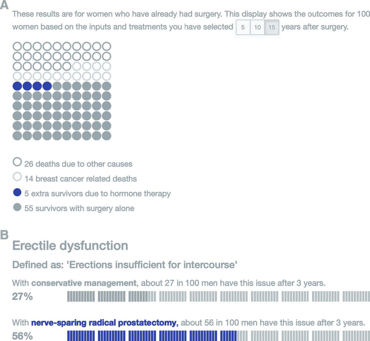
Two forms of icon array: (A) a traditional rectangular array showing multiple potential outcomes for 100 people (from the Predict:breast cancer risk communication tool34) and (B) icon arrays doubling as bar charts, aiding an easy comparison between different potential treatments (from the Predict:prostate cancer risk communication tool35). Original colours have been modified for DTB.
Icon arrays can double as bar charts, if they are visually laid out to aid the comparison of the areas in two adjacent arrays, and have an advantage over a traditional bar chart in showing those who are unaffected as well as those who are affected. There has been some research on whether dots, faces or people icons are best, but it is not a simple answer.27 Some people find the anthropomorphic icons more emotional, and knowing how much emotions can affect decision-making, dots or blocks are probably safer. (For make-your-own icon arrays, go to iconarray.com.)
Another type of graphic worth considering is a risk ladder (see figure 2). This puts risks along a number line, showing an order of likelihood. These have been used to help people understand a range of potential risks of a treatment option.28 However, how to help people understand the numbers on the scale (often logarithmic), or to choose any comparator risk that is shown on the scale to add context, is no simple task.26

An example of a risk ladder, in this case designed to help communicate anaesthetic risks.36
Be upfront and as precise as you can be about your uncertainties
No amount of evidence can give certainty about what might happen to an individual patient. All we can talk about is what appears to have happened to similar patients in the past if they took one treatment option or another. It is important to help patients understand that, and giving numbers as a range rather than as a precise-sounding point estimate could help. Our own experiments suggest that people understand the uncertainty around a number and do not lose trust in the provider of the statistics if it is given as a numerical range (rather than as a verbal qualifier, such as ‘estimated’ or ‘about’) (van der Bles et al, in prep).
For printed information: consider using fact boxes
Finally, for those who provide printed information about the evidence around treatment options, all of the above information has been combined to produce a standard, tested format known as a drugs fact box (see Box 5).29 These are in the form of a table summarising the potential benefits and harms clearly. Work is still ongoing to add graphics to them and refine them, but they are increasingly being adopted and there are guides available on how to make them.30
Free online resources to give people the evidence they need to decide on medical treatment
These are best used in a face-to-face consultation to help clarify the evidence and a patient’s values.
Ottawa Hospital Research Institute A to Z inventory of decision aids (http://decisionaid.ohri.ca/AZinvent.php).
NHS patient decision aids (https://www.nice.org.uk/about/what-we-do/our-programmes/nice-guidance/nice-guidelines/shared-decision-making).
Patient info decision aids (https://patient.info/doctor/decision-aids).
Mayo Clinic decision aids (https://shareddecisions.mayoclinic.org).
These are designed to be at-a-glance summaries of the evidence, ideal for printed materials:
Harding Center for Risk Literacy fact boxes (https://www.harding-center.mpg.de/en/fact-boxes).
University of Laval decision box (https://www.decisionbox.ulaval.ca/en/).
For those who are communicating evidence face-to-face, there is a free eLearning course now available on the eLearning for Healthcare platform or at moodle.wintoncentre.uk.
Conclusion
In summary, there is no right way to communicate evidence; although there are a few ways that are definitely wrong: those that confuse or push people in one direction or another. If you are preparing information for distribution, then test it with your intended audiences to see what they understand from it,31 and if you are talking to patients in person, keep asking them what they have understood so far. Moreover, remember: decisions are based on far more than just factual information. If a patient makes a decision that seems to contradict the evidence, it does not mean they have necessarily misunderstood; they could be making the right decision for them, all things considered.
Supplemental material
Supplemental material
References
Footnotes
Contributors ALJF researched and wrote this article. All members of the Winton Centre for Risk and Evidence Communication contributed to the work behind the Predict websites and their graphics, work understanding the needs of patients and work on the communication of uncertainty.
Funding This research received no specific grant from any funding agency in the public, commercial or not-for-profit sectors.
Competing interests The author helped develop the elearning course mentioned in the text but received and will receive no payment or other benefit from doing so. Disclosure of conflicts of interest form(s) are published online as supplementary files.
Provenance and peer review Commissioned and externally peer reviewed.